
Lede Atelier
A considered digital experience for a specialist automotive atelier.
Explore the project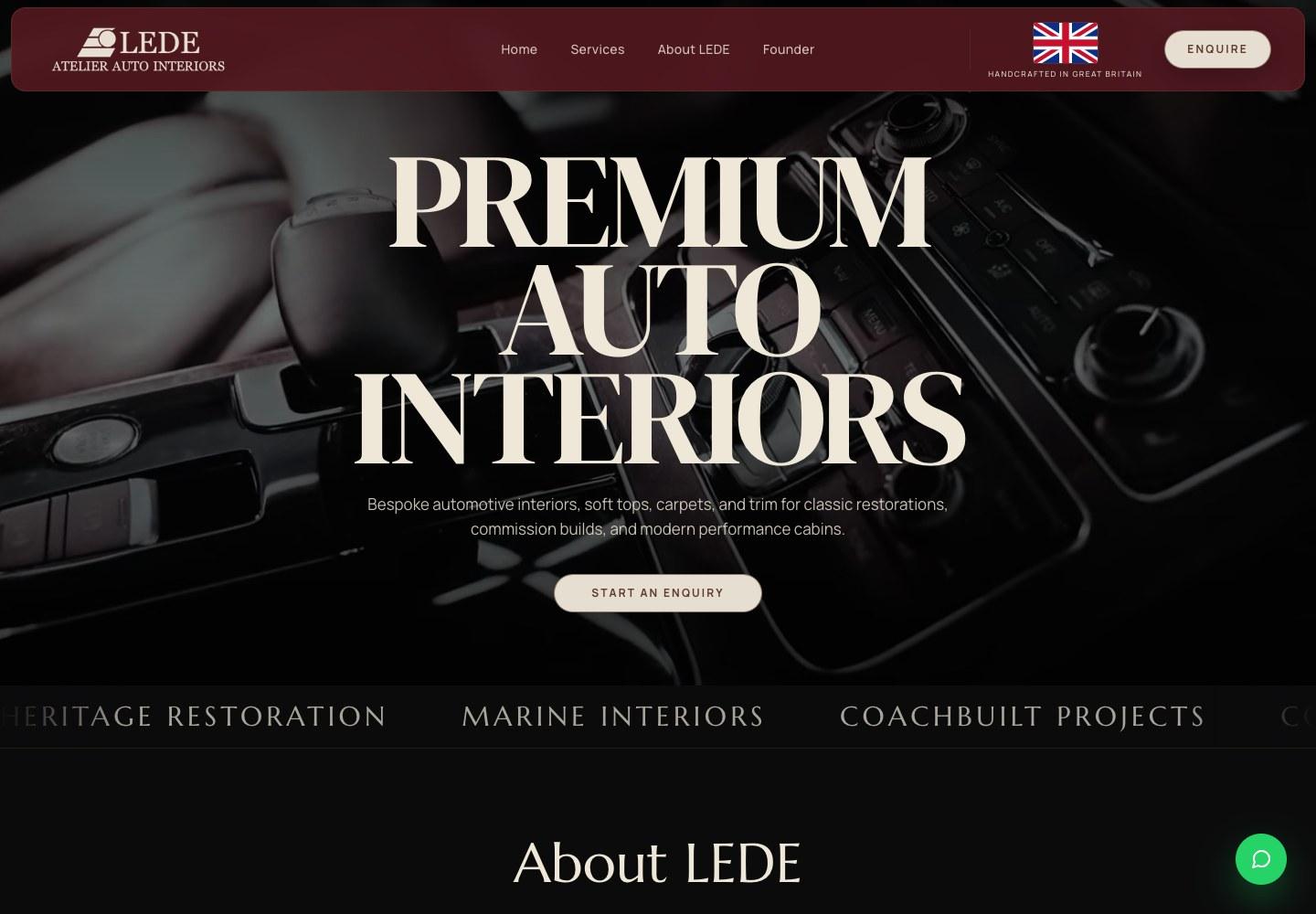
Website design and development for a specialist automotive atelier.
Lede Atelier creates bespoke automotive interiors, from classic restorations to contemporary commissions. Its work is defined by the choice of materials, the precision of a seam and the fit of every finished surface. The website needed to communicate that level of care to people discovering the atelier for the first time.
We brought Lede’s identity into a digital experience built around its craft. Generous photography and considered typography establish the character of the brand, while a clear structure connects its specialist services, workshop story and commissioning process. Visitors can explore the work in detail and find a straightforward route to an enquiry.
Making the quality
of the work tangible.
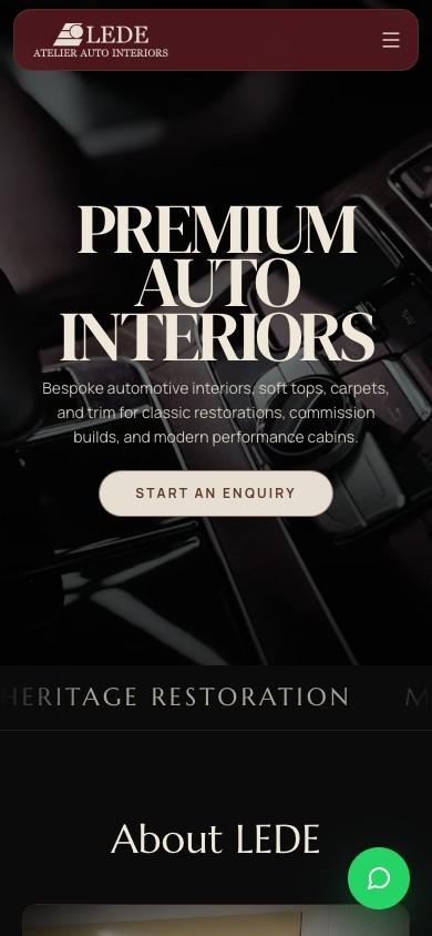
Automotive interiors are experienced through texture, fit and finish. A website has to communicate those qualities through a screen, while making a broad range of specialist services easy to understand.
The information architecture brings services, materials and workmanship into a coherent journey. Visitors can start with the type of work they need, explore the finish and understand how a commission takes shape. Across desktop and mobile, clear navigation and well-paced content keep a detailed subject approachable.
Made to be explored.
Desktop and mobile recordings show the website’s layout, pacing and navigation in use.
A visual language
for the web.
Burgundy, warm cream and dark surfaces echo the character of Lede’s interiors. Large serif headlines create a distinctive editorial feel, balanced by straightforward navigation and readable supporting copy.
The opening interior film introduces the quality and atmosphere of the work. Further into the site, the workmanship gallery, material swatches and workshop features reveal the process behind it. Movement supports this story: the film adds context, while transitions let photography and detail remain the focus.
Colour, type and hierarchy.
A restrained palette sets the atmosphere. Expressive serif type gives the headlines character, while a clean sans serif keeps the detail easy to read.
Colour palette
Five core colours- Burgundy#53181F
Brand accent & navigation
- Warm cream#E6DFD1
Primary text & contrast
- Near black#0B0B0C
Primary canvas
- Saddle brown#60392F
Secondary surfaces
- Soft copper#C49484
Readable accent
Typography
Character meets clarityThe art of
the interior.
Considered in every detail.
Manrope / Body & interfaceClear, measured typography guides visitors through the services, materials and commissioning process.
A consistent visual system connects the navigation, service pages and enquiry journey.
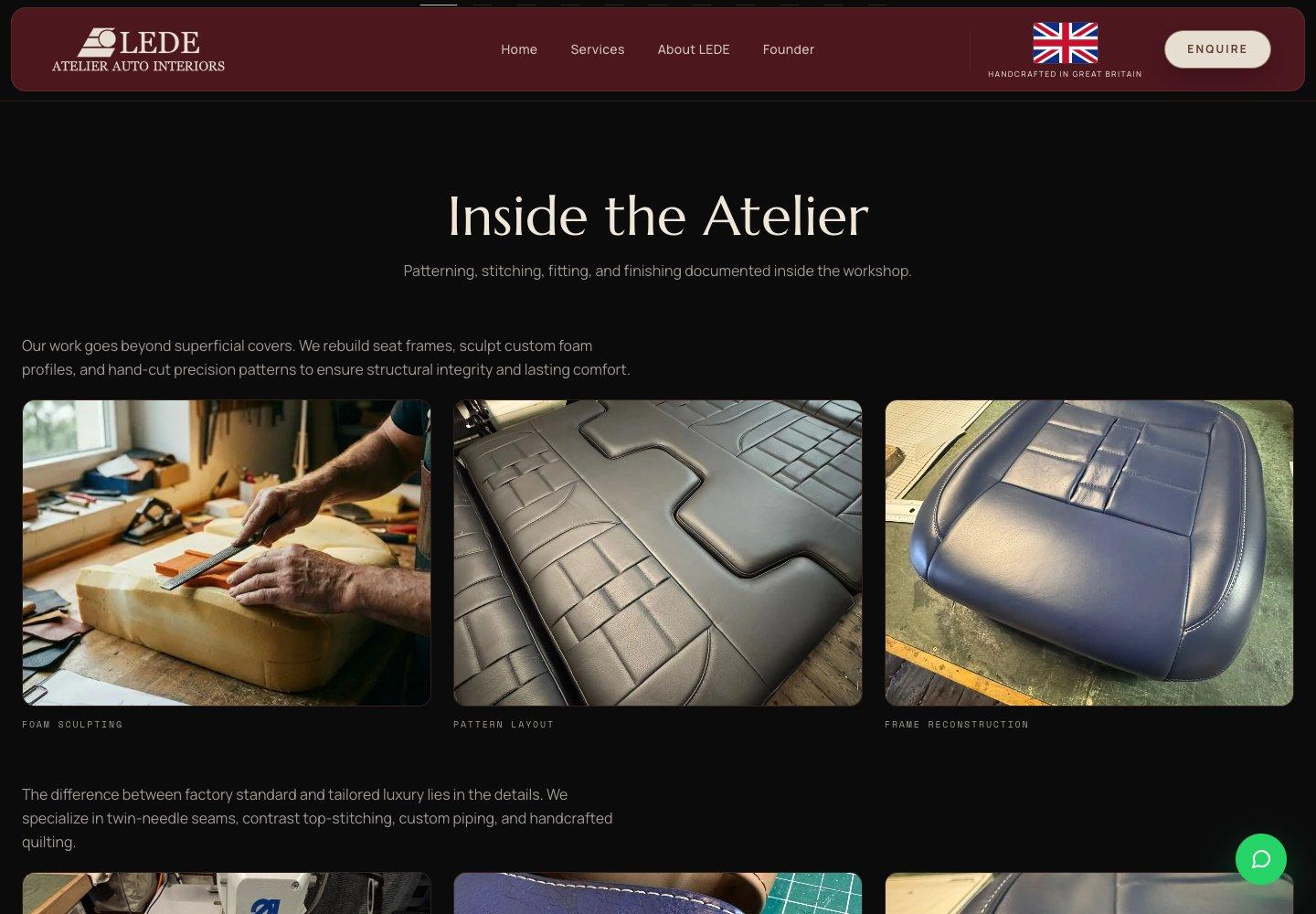
From inspiration
to enquiry.
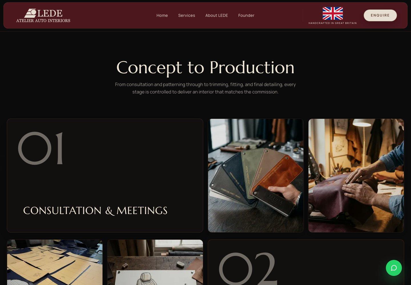
Dedicated service pages help visitors find the right starting point for their vehicle. The commissioning process explains what comes next, from consultation and design through to installation and finishing.
Enquiry links lead to a form that asks about the vehicle and project. On mobile, the content reorganises into a clear, readable sequence, keeping the work and the next step close at hand.
Built for the next chapter.
The website pairs a responsive front end with a custom CMS, giving the team a clear way to manage its content. This gives the project a foundation for maintaining its content as the atelier’s work develops.
Optimised imagery, layouts that adapt to different screen sizes and integrated enquiry handling support the experience beneath the surface. The result is a website that brings the craft, the services and the next step together.